Greenhouse Brand Portal
A web hub to house Greenhouse’s brand guidelines, assets and resources
About Project
In late 2019, Greenhouse updated its brand and visual identity.

Original brand guidelines from Order
Strategy and UX
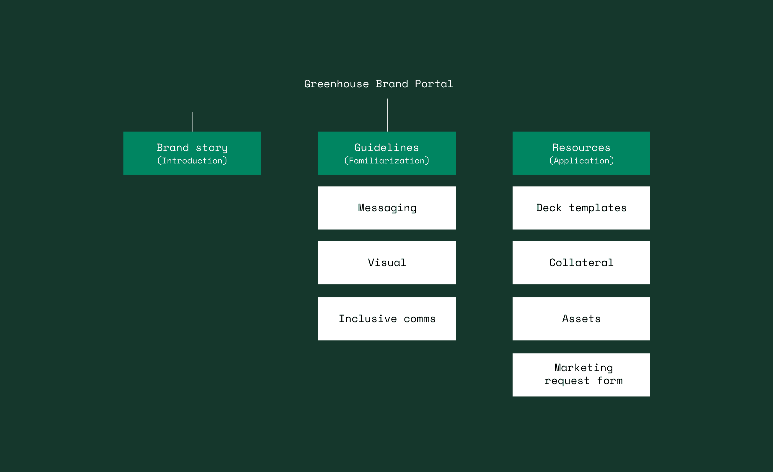
When conceptualizing the structure the website, I considered a specific goal each page should achieve in relation to the user’s understanding of the Greenhouse brand. I narrowed down to three main goals: introduce, familiarize, and apply. The Brand Story page would act as the official introduction to Greenhouse and provide an overview of the company’s purpose, mission, and values. The guidelines pages would help users become familiarized with Greenhouse by providing a concrete standard of how the brand should look and behave. Finally, the Resources page would provide users with the tools needed to successfully apply the brand across the work they do at/for Greenhouse.

Brand portal sitemap

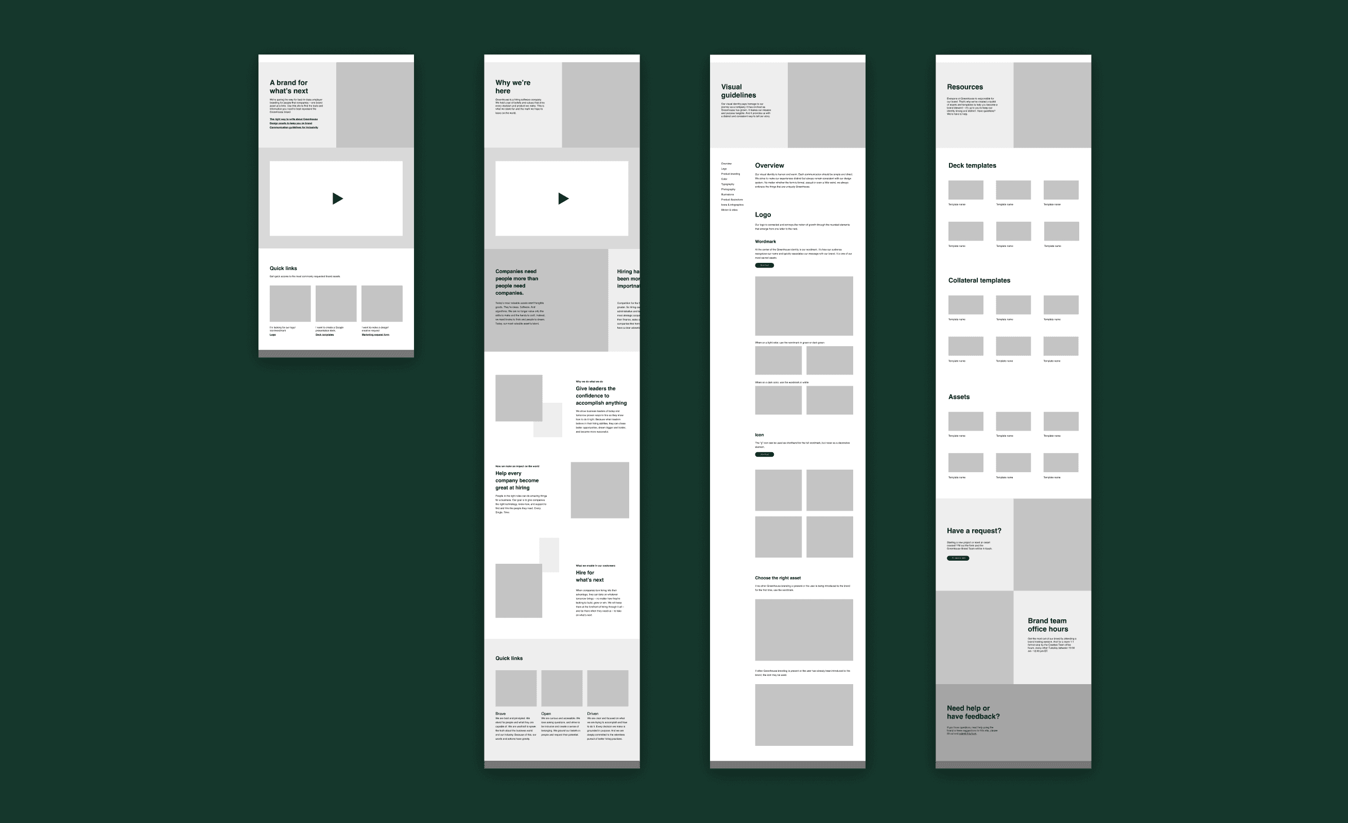
Wireframes

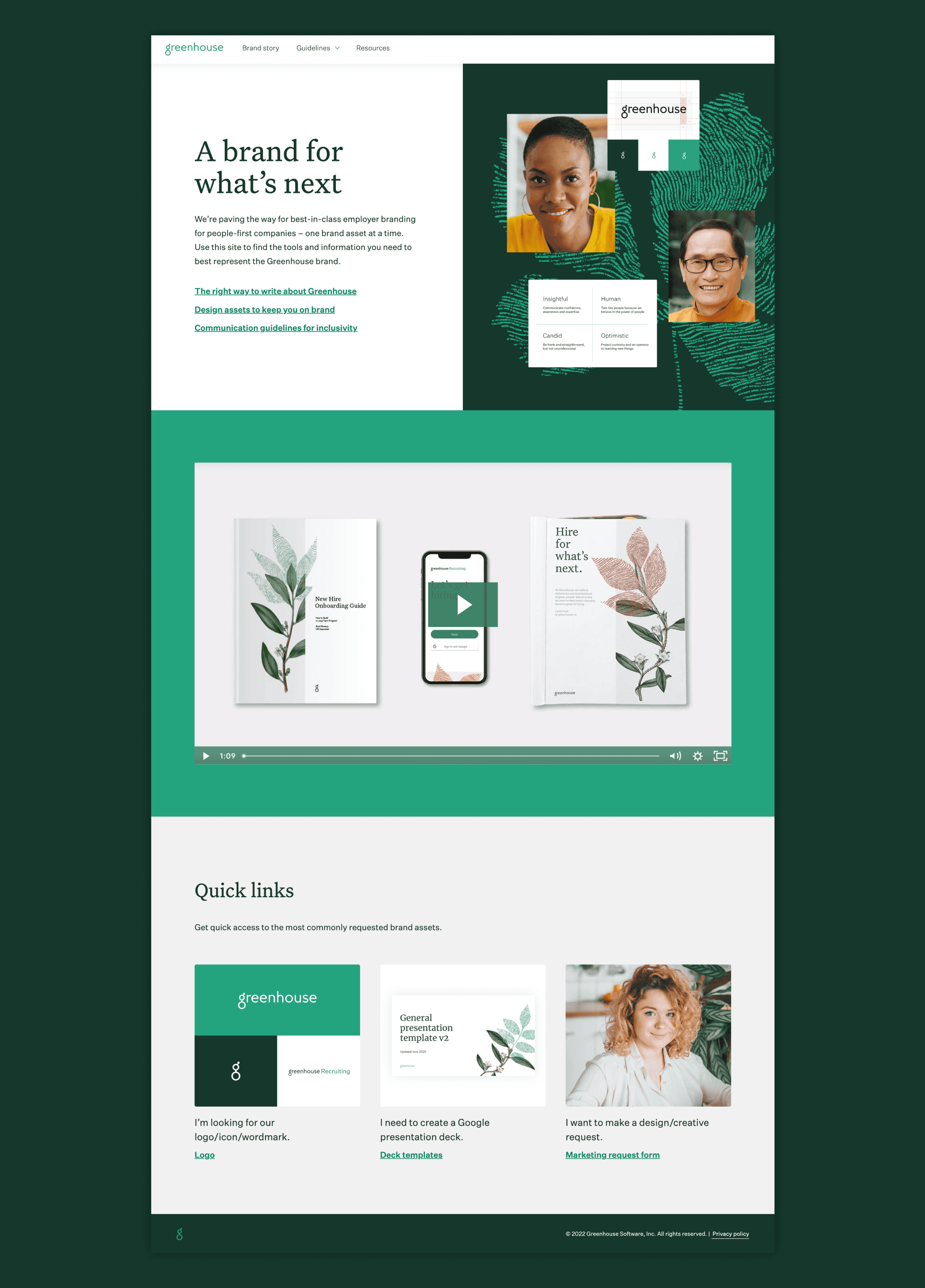
Brand portal homepage
The Brand story page introduces users to Greenhouse’s mission, values, and brand characteristics.
The Resources page houses links to the most used and requested resources for Greenhouse employees.
Easy access to information
A main goal of the project was to help users get the information they needed quickly. Direct links with clear language to where each link led to were placed in the hero of the homepage so that they were the first things a user would see. A drop down menu in the navigation bar with links to each guideline provided straightforward wayfinding for the user. Within each guideline, a secondary left rail navigation menu allowed users to quickly jump to different sections.
A dropdown menu provides users with direct links to each of the guidelines
A secondary left rail nav within each guideline allows users to easily jump to different sections
Interactive elements for engagement
To keep the user engaged with the content and allow for further absorption/understanding of the information, various interactive elements such as animations, clickable assets, and quizzes were sprinkled throughout the guidelines.
Various interactive elements were incorporated to keep readers engaged with the content
Empowered employees and a streamlined request process
The launch of the brand portal website helped streamline the overall creative process for the Creative Team. It lessened the amount of one-off requests by empowering employees with access to resources and guidance to inform their work. The brand portal continues to be an essential resource and is used to introduce and onboard new employees to the Greenhouse brand. It is also regularly sent as an easily accessible brand guideline to the various vendors, contractors, and partners that work with Greenhouse.
